Tishman Speyer
International Square
How rebranding and repositioning attracted new audiences.
Brand Development & Design
Brand Development & Design
International Square, an office building in the heart of Washington, DC, had a problem: they were struggling to attract tech tenants. In contrast to the sleek new developments they were competing with, the enormous 70s-era brutalist building felt gloomy and outdated. The size of the building turned off medium and small sized tenants who wanted smaller buildings where they could occupy an entire floor. On the verge of a modest renovation, the leasing team needed a new approach to attract the tech set without alienating their current conservative tenants.
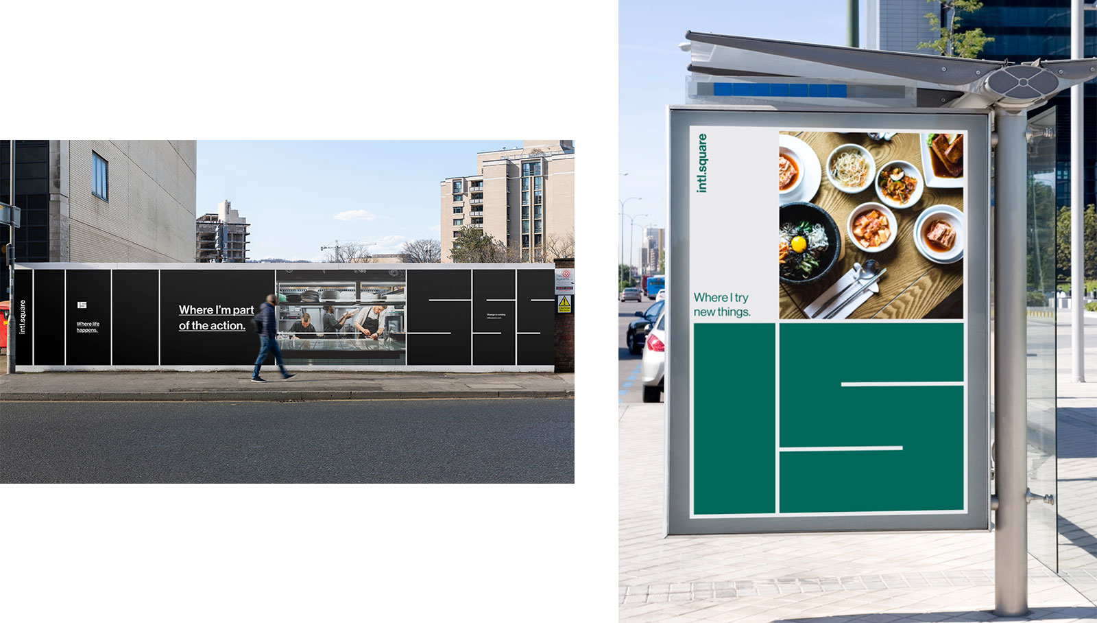
Our strategy was to reposition our biggest weakness – our size – as a competitive advantage. The building’s renovation would incorporate new services and amenities including a daycare, gym, food hall and grocery store. We found that true work-life balance was unrealistic for our high-performing tech set, and that a more fluid ‘work-life integration’ approach was becoming more popular. We repositioned the building to lean into this, positioning it as the place with everything you need to stay on top of life.
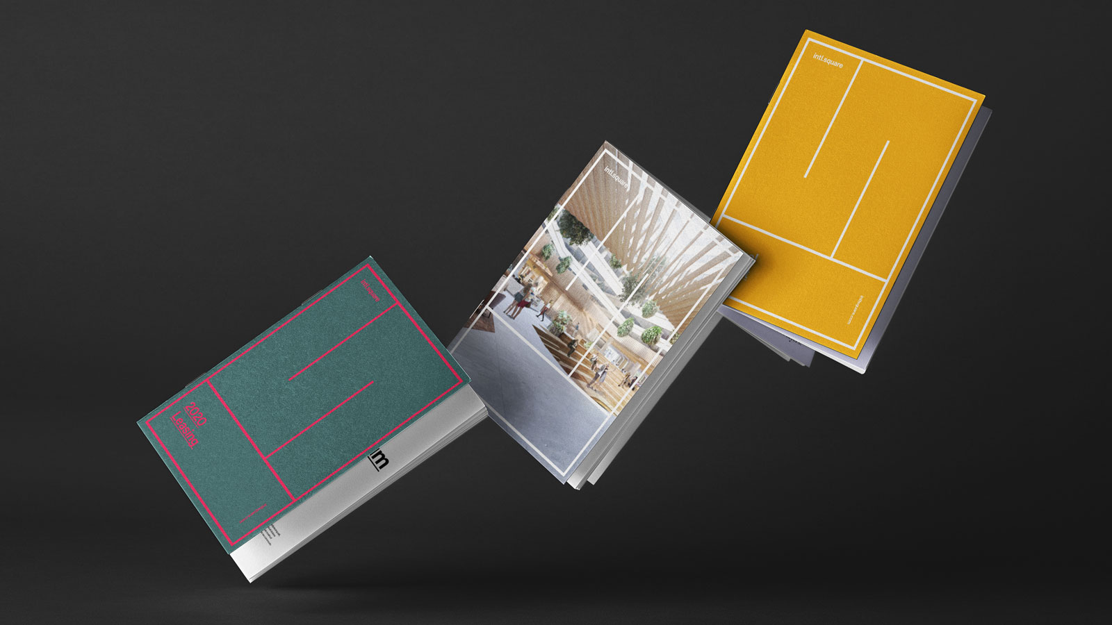
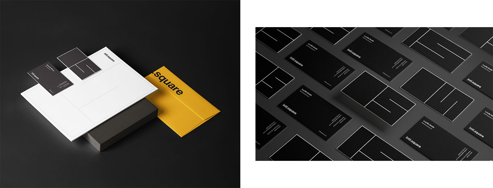
Along with repositioning, we rebranded. To appeal to a diverse tenant base while keeping the current conservative tenants in mind, we created a robust color palette to ensure flexibility from playful to corporate; a new font and iconography to modernize the brand while still keeping it timeless; and updated the brand photography and monogram.
To bring it all together, we rolled it all out onto a microsite, hoarding, brochures and even right down to their classy new business cards.